The page claims two buyers simultaneously and converts neither cleanly. The hero and download CTA target an individual engineer who wants to try the tool now — “Download for macOS” is a self-serve, zero-friction action. But the body copy, the “Request a demo” CTA, the Fortune 500 claim, the SOC 2 badge, and the “Explore enterprise” link all signal an enterprise procurement path that requires a champion, a security review, and a budget approval. These are not the same buyer, and they don’t make the same decision in the same session. The individual engineer who lands here sees “Trusted by over half of the Fortune 500” and reads it as a product for big companies — not for them. The enterprise buyer who lands here sees a macOS download button and no clear path to a sales conversation above the fold. Fix this by splitting the conversion surface: put the download path first and unambiguously for the individual engineer, then give the enterprise buyer a distinct section with a named path to the demo — not a secondary CTA buried below the testimonials.
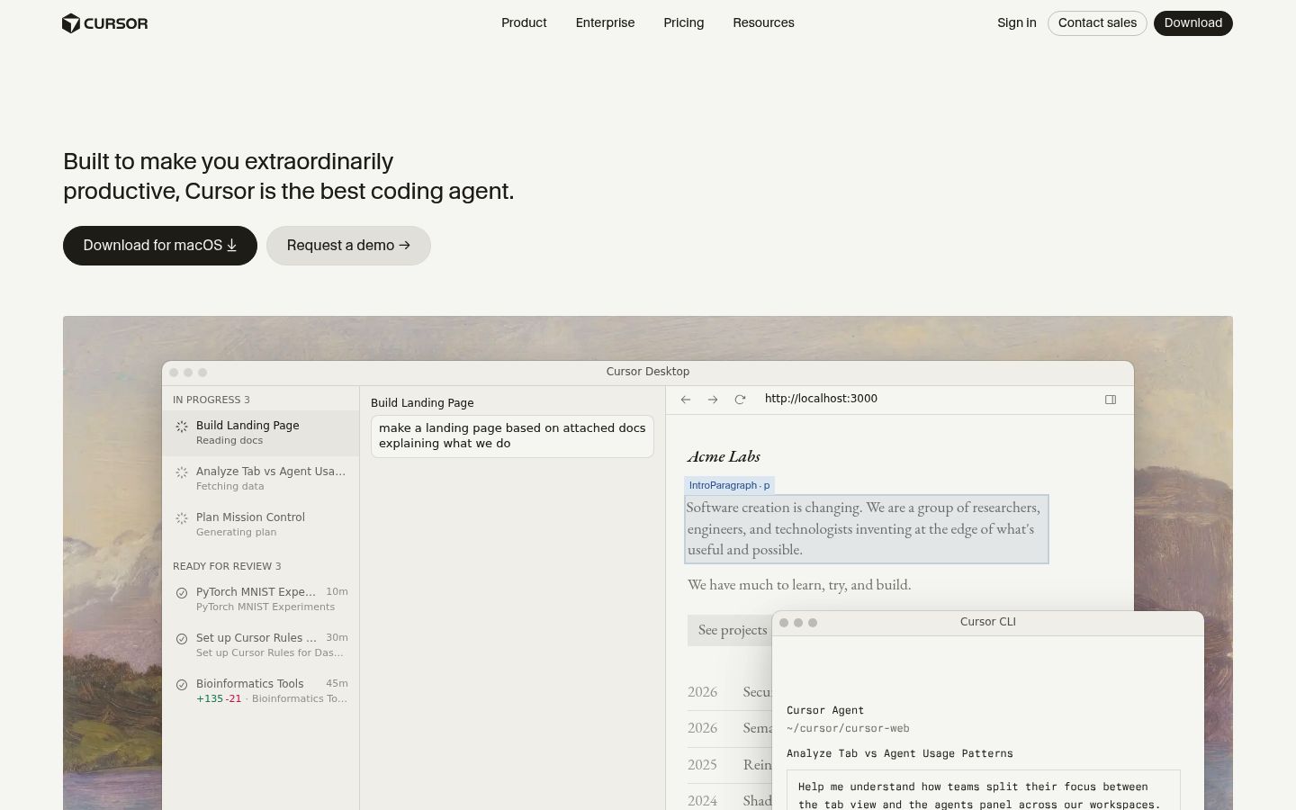
The hero on Cursor’s page as we read it.
Built to make you extraordinarily productive, Cursor is the best way to code with AI.
Where Cursor wins and where it leaks.
Cursor’s strongest dimension is Trust.
Trust scores 8.3 / 10. The dim covers 3 signals in the rubric; the page still has 2 findings in this area, but the overall score is strong relative to peers.
Structural patterns on Cursor’s page worth knowing.
The testimonials are the strongest asset on the page and they’re doing the wrong job. Jensen Huang saying 40,000 NVIDIA engineers use Cursor, Patrick Collison describing thousands of Stripe employees, Greg Brockman calling it the place where GPT-5 shines brightest — these are enterprise adoption signals, not individual conversion signals. They answer the question “is this safe to roll out at scale?” not “will this make me faster today?” But the page’s primary CTA is a personal download. The buyer who’s deciding whether to download and try it doesn’t need to know NVIDIA uses it; they need to know it will make them noticeably faster in the first hour. The page has the wrong proof for the action it’s asking the visitor to take. Move the Karpathy and shadcn quotes — both of which describe the product experience directly — above the fold or into the first scroll, and push the Huang and Collison quotes to the enterprise section where they belong.
The page names four distinct differentiation angles — autonomous agents, specialized Tab autocomplete, codebase understanding, and multi-model flexibility — and defends none of them. Each is introduced with a short label and a “Learn more” link, then abandoned. GitHub Copilot has autocomplete. Claude has multi-model options. Codeium has codebase indexing. The page lists the same features the category already offers without making a claim about why Cursor’s version is different. The one thing Cursor could own that competitors can’t easily match is the claim that the agent runs autonomously on its own computer, builds and tests end-to-end, and hands you a finished feature to review — that’s a genuinely different category claim, not a feature delta. The page buries it in the third section. Move the autonomous agent claim to the hero, make it the single thing the page is fighting for, and let every other feature serve as supporting evidence for that claim.
The changelog is present and public, which is a trust signal for developer buyers — but it’s positioned as a footer element, after the testimonials and blog highlights, where most visitors won’t reach it. Developer buyers, especially those evaluating against GitHub Copilot or Codeium, want to know the product is actively maintained and moving fast. The changelog entries visible on the page — PR Review, Cloud Agents, Cursor in Microsoft Teams, Bugbot Effort Levels — show a team shipping weekly. That velocity is a competitive advantage that the page treats as an afterthought. Pull the changelog strip up to immediately after the feature sections, frame it as evidence of shipping speed, and let the dates speak for themselves.
What’s costing Cursor, quoted from the page.
- 01The page assumes you know Cursor; most traffic doesn't.
“The page opens product-aware — 'Cursor is the best way to code with AI' assumes the visitor already knows what Cursor is and is weighing it against alternatives. But 82.78% of ranked search volume comes from unaware queries like 'ai\'s' (4,090,000 SV), 'downloadai' (823,000 SV), …”
Your page skips straight to 'here's why Cursor wins' without ever establishing what problem it solves or why an AI code editor matters. That works for the 7.81% of visitors who already know the category. The 82.78% arriving on unaware queries — many searching for mouse cursors, unrelated AI tools, or generic developer terms — get a hero that names a product they've never heard of and a download button with nothing to orient them. There's no fallback path: no 'here's the problem we solve' hook before the feature showcase, no softer entry point for cold visitors.
- 02The page never tells a buyer what Cursor costs.
“No pricing tier, no starting price, no 'free plan available' signal appears anywhere on the homepage. The footer links to no pricing page. The only commercial signal is 'Explore enterprise →', which implies custom pricing and repels self-serve buyers who want a number before they…”
The page never tells a buyer what Cursor costs. Engineers evaluating against GitHub Copilot or Codeium will leave to find pricing rather than stay to be convinced.
- 03Documentation and API reliability are buyer priorities absent from marketing
“In every tool, at every step — Cursor runs in your terminal, collaborates in Slack, and reviews PRs in GitHub. [no API docs, webhook, or integration compatibility reference]”
Buyers rank 'clear documentation' (100%), 'reliable API and webhooks' (88%), and 'API and system integration that actually works in production' (62%) as top purchase signals, but the landing page leads entirely with agent autonomy, Fortune 500 social proof, and model choice — with no mention of API reference docs, webhook support, or integration compatibility lists.
- 04The page has no named customer logos despite claiming over half the Fortune 500.
“NVIDIA and Stripe appear only in testimonial text. No logo lockup, no logo row, no 'used by' grid exists anywhere on the page. Customer logos are confirmed available from the brand context. The Fortune 500 claim is made twice — once in the hero social proof band, once in the ente…”
The page has no named customer logos despite claiming over half the Fortune 500. That claim reads as marketing copy without a single recognizable mark next to it.
- 05The page has no urgency signal anywhere.
“No trial expiry, no founding-pricing window, no limited-availability framing, no 'join X engineers already using Cursor this week' momentum signal. The download CTA is evergreen with zero consequence for delay.”
The page has no urgency signal anywhere. A developer who lands here can bookmark it, come back in three weeks, and nothing has changed. The page invites evaluation, not action.
Cursor’s other surfaces.
- cursor.comHomepage
- cursor.com/pricingTracked
- cursor.com/enterpriseTracked
About Cursor’s Lytms scan.
What did Lytms score Cursor's homepage?
What's Cursor's strongest dimension?
What's the weakest dimension on Cursor's page?
What's the biggest leak on Cursor's homepage?
How does Cursor compare to peers?
When was Cursor's page last scanned?
One-click citation for press, blog, and academic use.
Lytms scans of public B2B SaaS landing pages are independent and free to cite. Pick a format below and we’ll copy it to your clipboard.
Lytms Research Team. (2026). Cursor landing page review (Lytms score 7.4/10). Retrieved May 17, 2026 from https://lytms.ai/brand/cursor
Score yours like Cursor. See yours.
One URL. About 2 minutes.