The page is trying to reposition Linear from issue tracker to AI product system, but it buries the most credible proof of that shift — the Ramp customer story, where Linear’s coding agent accounts for 60% of merged PRs — inside a customer page that most homepage visitors will never reach. The homepage testimonials are enthusiastic but vague: “you will just feel it” and “just excellent” are fan quotes, not evidence that the AI-native workflow claim is real. The one testimonial that gestures at outcomes (“action biased”) doesn’t connect to the AI agent story at all. The page is making a category-level claim — “issue tracking is dead” — without showing the buyer what killed it and what replaced it. Pull the Ramp agent stat onto the homepage, above the numbered workflow sections, and let it do the work the vague pull quotes can’t.
The hero on Linear’s page as we read it.
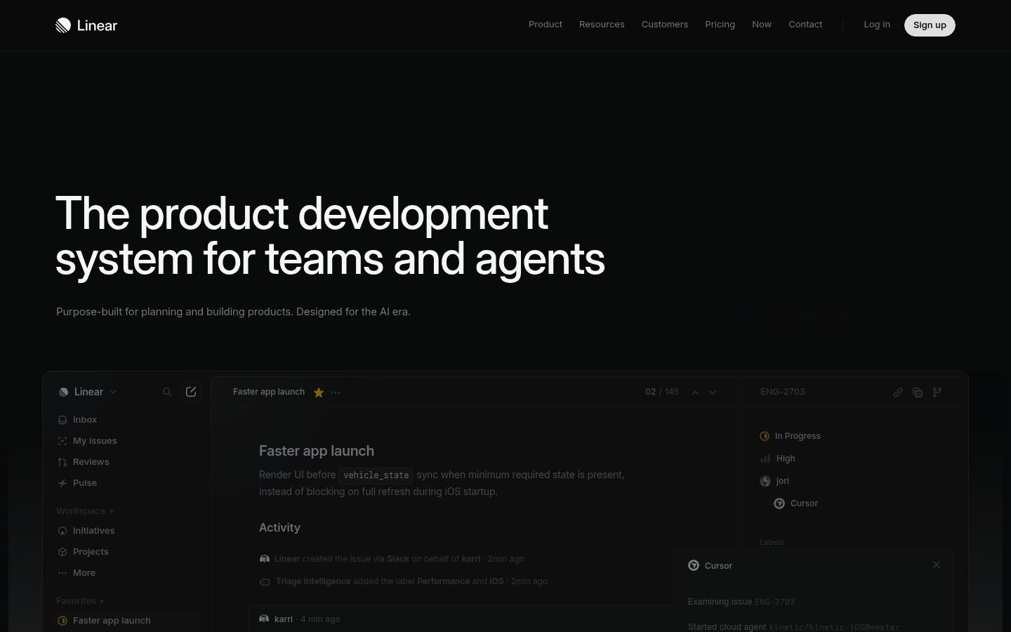
The product development system for teams and agents
Where Linear wins and where it leaks.
Linear’s strongest dimension is Post-click.
Post-click scores 6.6 / 10. The dim covers 4 signals in the rubric; the page still has 2 findings in this area, but the overall score is strong relative to peers.
Structural patterns on Linear’s page worth knowing.
The page opens with “The product development system for teams and agents” and immediately follows with “Purpose-built for planning and building products. Designed for the AI era.” These two sentences describe two different products — one is a human-plus-agent collaboration system, the other is a planning tool for human teams. The numbered workflow sections (1.0 Intake through 5.0 Monitor) then present a complete product ops pipeline, which is a third framing entirely. A buyer landing from a search for issue tracking software encounters three different category frames in the first scroll. The page needs to commit to one: either Linear is the system where agents do product work alongside humans (the most differentiated claim, and the one competitors can’t match today), or it’s the best-designed planning tool for fast teams (the legacy positioning). The current page tries to hold both and lands neither.
The “Issue tracking is dead” callout links to linear.app/next but sits mid-page with no context — the buyer who hasn’t already read the announcement doesn’t know what they’re clicking into or why it matters to them right now. This is the sharpest positioning move on the page, and it’s treated as a sidebar. If Linear genuinely believes the category has shifted, that claim belongs in the hero, not as a mid-scroll aside with an arrow link. Either lead with the shift and let the rest of the page prove it, or remove the callout entirely — a half-committed category declaration reads as hedging, not confidence.
The page has five workflow sections (Intake, Plan, Build, Diffs, Monitor) each with its own headline, description, and UI mockup. For a buyer who already uses Jira and is evaluating a switch, this is the right content — it maps the full replacement. But for a buyer who arrived from a “fast issue tracker” search or a word-of-mouth referral, five sequential feature sections with no single conversion surface between them is a reading assignment, not a path to signup. There is one CTA above the fold (“Sign up”) and one cluster at the bottom (“Get started / Contact sales / Open app / Download”), with nothing in between across the longest part of the page. A buyer who gets curious at section 3.0 Build has no way to act without scrolling back to the top. Add a signup surface after the Build section — that’s where the agent workflow claim peaks, and it’s the moment a buyer is most likely to want to try it.
The enterprise page at linear.app/enterprise describes Linear as “An AI product system for modern enterprises,” while the homepage calls it “The product development system for teams and agents.” These are close but not the same claim, and the difference matters: “enterprise” implies a buyer who needs governance, scale, and security; “teams and agents” implies a buyer who wants speed and AI integration. A mid-market engineering lead evaluating both pages will notice the inconsistency and read it as a brand that hasn’t decided what it is. Pick the frame that fits the homepage ICP — Series B+ product and engineering teams — and make the enterprise page a vertical of that frame, not a parallel one.
What’s costing Linear, quoted from the page.
- 01Your three testimonials are from OpenAI, Ramp, and Opendoor — logos that carry real weight — but none of them say anything a buyer can use to justify a switch.
“All three pull quotes are vague sentiment ('feel it,' 'action biased,' 'just excellent'). No quote names a specific outcome, a metric, a workflow problem solved, or a before/after. The named companies are high-credibility but the words attached to them are the weakest possible us…”
Your three testimonials are from OpenAI, Ramp, and Opendoor — logos that carry real weight — but none of them say anything a buyer can use to justify a switch. 'You will just feel it' and 'just excellent' are enthusiasm, not evidence. The logos do the heavy lifting and the words waste the moment.
- 02The page never gives a buyer a middle step between 'reading the homepage' and 'creating an account.
“The only CTAs on the page are 'Sign up,' 'Get started,' 'Contact sales,' and 'Open app.' No 'Watch a demo,' no 'Take a tour,' no interactive preview. The five workflow sections (Intake through Monitor) show static UI mockups but offer no way to experience the product without crea…”
The page never gives a buyer a middle step between 'reading the homepage' and 'creating an account.' There is no demo, no product tour, no video walkthrough. For a team evaluating a switch from Jira, that gap kills momentum — they want to see the product before they commit to signup friction.
- 03No-code automation demanded by buyers; no such claim on page
“Make product operations self-driving — Turn conversations and customer feedback into actionable issues that are routed, labeled, and prioritized for the right team.”
Buyers rank 'no-code workflow automation' as a stated need (38%) and flag 'complexity that requires training before the team will actually use it' as a red flag. The marketing page emphasizes 'build and deploy AI agents' and 'Code Intelligence gives Linear Agent controlled access to your codebase' — language that implies engineering involvement. No surface on the page or in recent changelog entries explicitly addresses no-code or low-code automation for non-technical users.
- 04Your hero claims 'AI era' design while two peers say the same thing.
“LP says "The product development system for teams and agents" / "Designed for the AI era."; Asana says "The OS for human-agent teams"; Monday.com says "Outpace everyone with the best AI work platform."”
Your subheadline — "Designed for the AI era" — is the same claim Asana and Monday are leading with in nearly identical language. The specific thing Linear actually owns (structural diffs for agent code review, a numbered workflow from Intake to Monitor) never appears before the scroll.
- 05The hero offers signup before giving evaluators a place to land.
“Sign up”
The hero button goes straight to account creation, but product-aware buyers — teams actively comparing Linear to Jira or their current tool — aren't ready to create an account yet. They want to check pricing, see how it fits their team size, or confirm it's worth switching before committing to a signup flow. 'Contact sales' exists, but it's buried in the footer with no path to it from the hero.
Linear’s page vs what its buyers actually say.
The page’s headline + body language overlaps 50% with phrases buyers in this category use in reviews + interviews. Top-tier landing pages typically land in the 35-55% range; below that, the page is speaking analyst rather than buyer.
- “visibility into what's happening across the team”
- “track tasks and deadlines in one place”
- “customizable workflows”
- “ownership needs to be defined”
- “status needs to live somewhere other than a conversation or memory”
- “approvals need to be trackable”
Linear’s other surfaces.
- linear.appHomepage
- linear.app/pricingTracked
- linear.app/customersTracked
About Linear’s Lytms scan.
What did Lytms score Linear's homepage?
What's Linear's strongest dimension?
What's the weakest dimension on Linear's page?
What's the biggest leak on Linear's homepage?
When was Linear's page last scanned?
One-click citation for press, blog, and academic use.
Lytms scans of public B2B SaaS landing pages are independent and free to cite. Pick a format below and we’ll copy it to your clipboard.
Lytms Research Team. (2026). Linear landing page review (Lytms score 6.0/10). Retrieved June 7, 2026 from https://lytms.ai/brand/linear
Score yours like Linear. See yours.
One URL. About 2 minutes.