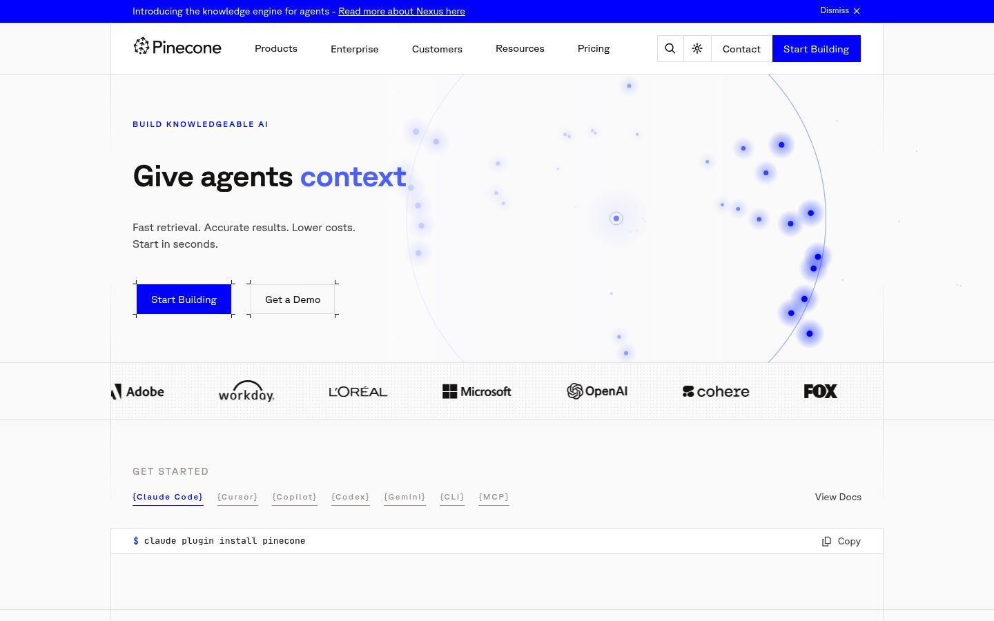
The page opens with “Build Knowledgeable AI / Give agents knowledge” and immediately drops into a terminal command for Claude Code. That sequence assumes the visitor already knows what a vector database is, why they need one, and that Pinecone is the right one — before a single word of explanation has appeared. The page skips the shift entirely: there’s no moment where it names the problem the buyer is living with (agents that hallucinate because they have no memory, RAG pipelines that break under load, search that degrades at scale) and connects Pinecone to the solution. The buyer who lands here from a search like “vector database for agents” is solution-aware but not yet Pinecone-aware; they need thirty seconds of “here’s the problem we solve and why we solve it better” before they’re ready to run a terminal command. Move the architecture section’s framing — “fully managed, writes instantly searchable, queries stay fast at any scale” — into the hero, and let the terminal onboarding follow once the visitor has a reason to care.
The hero on Pinecone’s page as we read it.
Build Knowledgeable AI Give agents knowledge
Where Pinecone wins and where it leaks.
Pinecone’s strongest dimension is Craft.
Craft scores 6.4 / 10. The dim covers 4 signals in the rubric; no findings landed against it on this page — clean execution.
Structural patterns on Pinecone’s page worth knowing.
The page tries to own four distinct positions at once: the fastest database (sub-100ms latency), the easiest database (zero ops, no tuning), the most scalable database (2.8B vectors), and the most isolated database (namespaces for multi-tenant agents). Each of those is a defensible claim. None of them is the claim. Weaviate leads on open-source flexibility, Qdrant leads on self-hosted control, Chroma leads on developer simplicity — Pinecone’s actual wedge, the one none of those competitors can match, is fully managed at enterprise scale with zero ops overhead. That’s the one word the page should be fighting for: managed. Instead, the page distributes attention across latency numbers, write throughput, filter speed, and namespace counts, and the visitor leaves without a single sharp impression of what Pinecone is for. Collapse the differentiation to one axis — managed, at scale, no ops — and let every metric on the page serve that single claim rather than compete with it.
There are no named customers anywhere on this page. The logo bar (Adobe, Workday, Microsoft, OpenAI, Cohere) appears to exist based on the business profile, but no quote, no named engineer, no specific outcome is attached to any of them. The use case tabs show impressive internal metrics — 1.7M namespaces, 30M writes/day, 2.8B vectors — but the visitor reads those as Pinecone’s own infrastructure claims, not proof that real teams shipped real products on top of Pinecone. The docs pages reference Pinecone Assistant and reference architectures, which means real use cases exist; the homepage just doesn’t surface them. Add one named customer quote per use case tab — a specific team, a specific outcome, a specific before/after — and the metrics transform from benchmarks into evidence.
The page has two CTAs — “Start Building” and “Get a Demo” — but they appear in the same visual weight at the bottom of the page, and “Start Building” appears alone at the top. The visitor who is a solo engineer evaluating for a side project and the visitor who is a platform lead at a Series B company evaluating for a production agent deployment are being sent to the same place. The enterprise section exists but it’s a feature list, not a path — “Explore Enterprise” goes somewhere, but the page doesn’t differentiate the journey before that click. The self-serve buyer needs to reach a working index; the enterprise buyer needs to reach a human. Give each buyer a distinct path from the hero: one CTA for “start free, first index in minutes” and one for “talk to the team about production scale,” differentiated by label and by position, so neither buyer has to guess whether Pinecone is for them.
What’s costing Pinecone, quoted from the page.
- 01Your reviews exist but none of their language appears on the page.
“Aggregator reviews exist but no quote, no reviewer job title, no specific outcome pulled from those reviews appears anywhere on the page. The social proof section is limited to compliance certifications. A competitor like Weaviate or Qdrant showing a single concrete engineer quot…”
Your reviews exist but none of their language appears on the page. Engineers evaluating infrastructure read what other engineers say — your page gives them nothing to anchor on.
- 02Cost estimator covers only serverless; pod-based pricing is absent from page
“Cost-performance at any scale — Estimate the cost of your workload.”
The landing page presents an interactive cost estimator under 'Cost-performance at any scale' with no stated scope limitation, implying it covers all workloads. Documentation notes the estimator applies to serverless indexes only, and pod-based indexes — a distinct pricing model — are not represented. Buyers asking for 'clear pricing' (38%) encounter an estimator that silently excludes a major pricing tier.
- 03Your logo bar names OpenAI, Microsoft, and Adobe but gives visitors no reason to believe those companies chose Pinecone over Weaviate, Qdrant, or self-hosted Milvus.
“The page has a logo bar with six named enterprise brands and zero attributed quotes, zero outcome metrics tied to a named customer, and zero case study links. Reviews exist on aggregators. The page's own metrics (1.7M namespaces, 2.8B vectors) are presented as product stats, not …”
Your logo bar names OpenAI, Microsoft, and Adobe but gives visitors no reason to believe those companies chose Pinecone over Weaviate, Qdrant, or self-hosted Milvus. Logos without context are decoration, not proof.
- 04The page never tells a platform team evaluating for production what happens when something goes wrong — no SLA numbers in the hero, no incident response language, no uptime figure above the fold.
“Uptime SLAs, support SLAs, and dedicated customer success are mentioned once, in the Enterprise block near the bottom. SOC 2 / HIPAA certifications appear only in the social proof bar. A Series B+ platform team scanning the hero gets zero reliability signal before scrolling.”
The page never tells a platform team evaluating for production what happens when something goes wrong — no SLA numbers in the hero, no incident response language, no uptime figure above the fold. That information exists but is buried in the Enterprise section.
- 05Your hero subheadline lists claims every peer already makes.
“LP subheadline says "Fast retrieval. Accurate results. Lower costs. Start in seconds."; Milvus says "high-speed searches, and scale to tens of billions of vectors with minimal performance loss"; Qdrant says "Ship high performance, full-feature vector search at any scale." Meanwhi…”
Your subheadline falls back to speed-and-accuracy claims that Milvus and Qdrant both lead with. The thing that actually separates Pinecone — zero ops, automatic indexing, writes searchable in seconds — lives three sections down, past the cost estimator.
Pinecone’s other surfaces.
- pinecone.ioHomepage
- pinecone.io/pricingTracked
- pinecone.io/productTracked
About Pinecone’s Lytms scan.
What did Lytms score Pinecone's homepage?
What's Pinecone's strongest dimension?
What's the weakest dimension on Pinecone's page?
What's the biggest leak on Pinecone's homepage?
When was Pinecone's page last scanned?
One-click citation for press, blog, and academic use.
Lytms scans of public B2B SaaS landing pages are independent and free to cite. Pick a format below and we’ll copy it to your clipboard.
Lytms Research Team. (2026). Pinecone landing page review (Lytms score 6.0/10). Retrieved May 17, 2026 from https://lytms.ai/brand/pinecone
Score yours like Pinecone. See yours.
One URL. About 2 minutes.