The page claims to be “financial infrastructure” but then lists six distinct product categories in the body — payments, billing, card issuing, crypto, embedded finance, and agentic commerce — without telling any specific buyer which one is for them. A founder evaluating payment processing, a platform company considering embedded finance, and an enterprise treasury team exploring stablecoins are three different buyers with three different problems, and this page treats them as one. The result is a page that reads like a product directory rather than a conversion surface: the visitor can see everything Stripe does but can’t locate themselves in it. The structural fix is to add a routing layer — either a segment selector above the body (“I’m building a SaaS / marketplace / platform / enterprise”) or distinct CTA paths that branch by use case — so each visitor type gets a directed path rather than a comprehensive list.
Where Stripe wins and where it leaks.
Stripe’s strongest dimension is Trust.
Trust scores 8.1 / 10. The dim covers 3 signals in the rubric; no findings landed against it on this page — clean execution.
Structural patterns on Stripe’s page worth knowing.
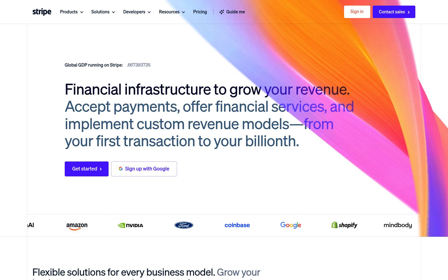
The hero does the hardest work on the page and then stops short. “Financial Infrastructure to Grow Your Revenue” is a category claim, not a positioning claim — it tells the visitor what Stripe is but not why Stripe over Adyen, Checkout.com, or PayPal for their specific situation. Stripe’s actual differentiation — the one that shows up in the customer stories, the developer tooling, the API-first architecture — is that it lets technical teams build financial products they couldn’t build on legacy processors, not just accept payments faster. The hero gestures at scale (“first transaction to your billionth”) but scale is table stakes at this market position; every serious competitor claims it. The move is to replace the category label in the hero with the specific claim Stripe owns: that the platform is buildable, not just usable — the difference between infrastructure you configure and infrastructure you extend.
The proof on the page is all volume and uptime — “$1.9tn processed,” “99.999% uptime,” “200M+ subscriptions” — and none of it is attributed to a named outcome for a named customer. The customer logos appear (Hertz, Instacart, Substack, ElevenLabs) but without a single sentence explaining what any of them built or what changed when they moved to Stripe. The case study pages exist — Hargreaves Lansdown reduced failed payments by £540m; Lovable scaled through an AI boom — but none of that language surfaces on the homepage. A visitor who lands here and needs to justify the decision internally has no concrete story to carry back; they have statistics. Pull one specific customer outcome above the fold and attach a name to it; the volume stats can stay, but they need a human result alongside them.
The single CTA — “Start now” — is doing the same job across the entire page regardless of where the visitor is in their decision. A developer evaluating the API for a new build is ready to start now. A Head of Finance at a mid-market company considering switching processors is not — they need a demo, a migration guide, or a conversation. The page has one conversion path for two fundamentally different buyer readiness levels, and the self-serve path (“Start now”) implicitly tells the enterprise buyer they’re in the wrong place. Add a second CTA path — “Talk to sales” or “See how migration works” — positioned for the buyer who isn’t ready to create an account, and differentiate the two paths visually so neither buyer has to guess which one is for them.
Stripe’s other surfaces.
- stripe.comHomepage
- stripe.com/pricingTracked
- stripe.com/enterpriseTracked
- What Is a Landing Page Audit? (And How to Do One in 2 Minutes)
- The Marketing Quality Gate: Why Your Content Pipeline Needs One
- How to Improve Your Landing Page Message (Headline, Value Prop, and Voice)
- How to Improve Trust on Your Landing Page (Above the Price, Above the Fold)
- How to Improve Your Post-Click Experience (Mobile, Performance, Accessibility, Coherence)
About Stripe’s Lytms scan.
What did Lytms score Stripe's homepage?
What's Stripe's strongest dimension?
What's the weakest dimension on Stripe's page?
When was Stripe's page last scanned?
One-click citation for press, blog, and academic use.
Lytms scans of public B2B SaaS landing pages are independent and free to cite. Pick a format below and we’ll copy it to your clipboard.
Lytms Research Team. (2026). Stripe landing page review (Lytms score 8.0/10). Retrieved June 8, 2026 from https://lytms.ai/brand/stripe
Score yours like Stripe. See yours.
One URL. About 2 minutes.