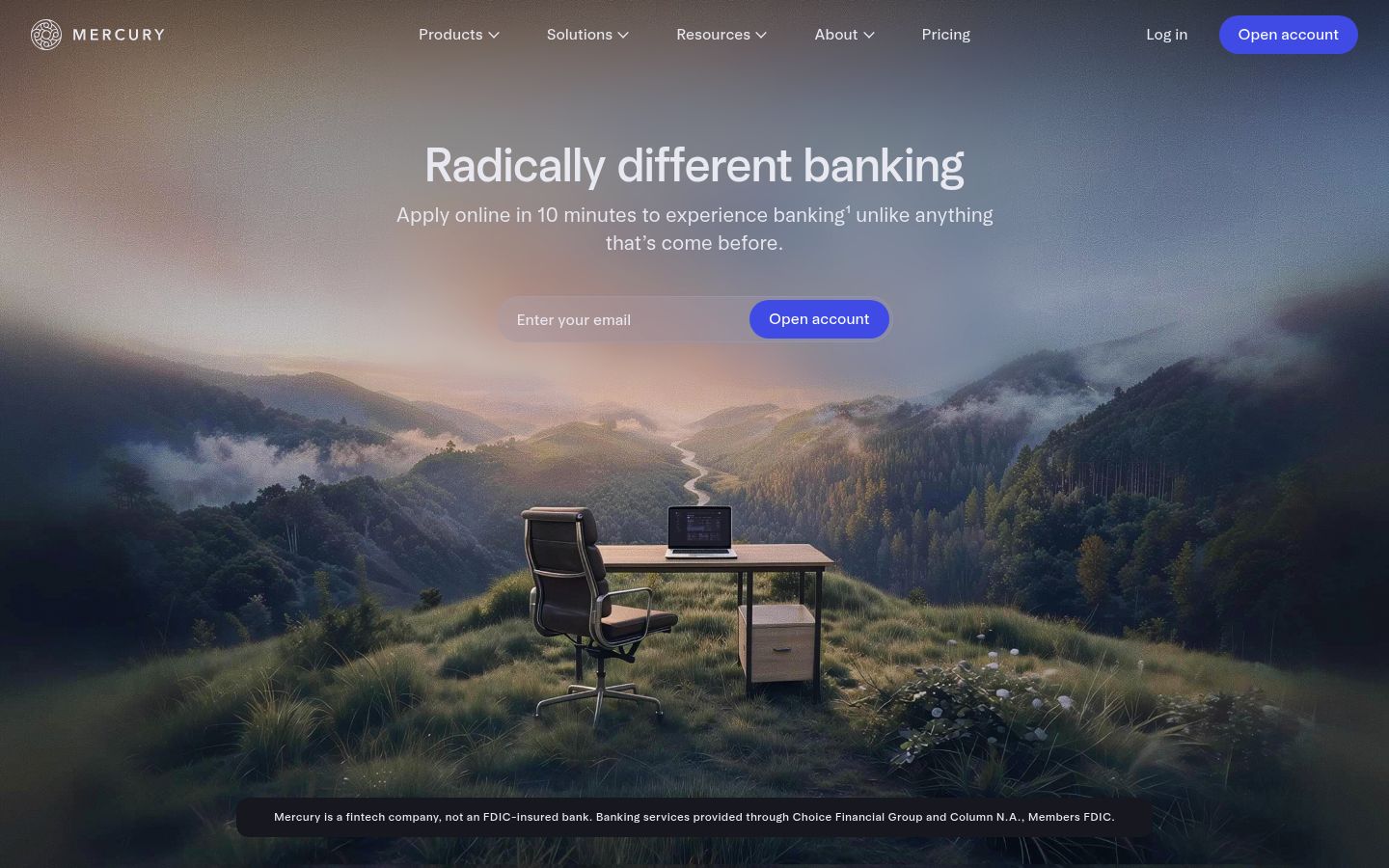
The headline “Radically different banking” makes a claim the page never proves. The word “radically” demands a specific contrast — what exactly is different, and different from what — but the page immediately retreats into feature lists: free checking, 1.5% cashback, AI bill pay, virtual cards. Brex, Ramp, and Wise all have pages that look structurally identical to this one: a bold adjective in the hero, then a grid of product capabilities. The page is asserting differentiation while demonstrating category conformity. The fix is not a new headline — it’s a structural one: the page needs one section, placed immediately after the hero, that names the specific thing Mercury does that no competitor does, in terms a founder can verify. “1 in 3 startups choose Mercury” is the closest thing to a proof of difference on the page, and it’s buried in a stat strip below the fold.
Mercury scored 6.0/10.
Your biggest trust objection — the $5M FDIC coverage — lands after six sections selling features to buyers who already left.
The hero on Mercury’s page as we read it.
Radically different banking
Where Mercury wins and where it leaks.
Mercury’s strongest dimension is Post-click.
Post-click scores 7.2 / 10. The dim covers 4 signals in the rubric; the page still has 1 finding in this area, but the overall score is strong relative to peers.
Structural patterns on Mercury’s page worth knowing.
The page is trying to convert two meaningfully different buyers — the solo founder opening a first business account, and the finance lead at a scaling company managing team spend, treasury, and accounting integrations — and it gives both of them the same single CTA: “Open account.” These buyers are not in the same decision. The solo founder wants to know it’s fast and free. The scaling company’s finance lead wants to know about NetSuite sync, approval flows, and whether Mercury can replace three tools they’re already paying for. The page layers features for both audiences across every section without ever separating the paths. The result is that neither buyer feels the page was built for them. Add a second conversion path — “Open account” for the founder, “Talk to us” or “See Mercury for teams” for the finance lead — and split the feature sections to serve each audience’s actual decision criteria rather than stacking everything into one undifferentiated scroll.
The testimonials are the strongest asset on the page and they’re doing almost no work. Karri Saarinen of Linear, Paul Copplestone of Supabase — these are names that carry real weight with the exact buyer Mercury is targeting. But the quotes attached to them are generic: “unlike most financial institutions, Mercury is built on software” and “the vision and craft is so far beyond what traditional banking can provide.” These read like marketing copy written in a founder’s voice, not like a founder describing a specific moment where Mercury changed how they operated. The page has named proof from credible sources and then stripped out the specificity that makes named proof convert. Replace the current quotes with quotes that name a concrete outcome — time saved, a specific feature that replaced another tool, a moment where Mercury did something their old bank couldn’t — and move at least one of these testimonials above the feature grid, not below it.
The security and FDIC section (“Standard protection stops short. Mercury goes further”) appears near the bottom of the page, after six feature sections. This is structurally backwards for the buyer Mercury is targeting. A founder moving their company’s operating cash to a new fintech — not an FDIC-insured bank, as the footer correctly discloses — has a trust question that needs to be answered before they care about cashback rates or virtual card creation. The “$5M FDIC coverage through partner banks” claim is genuinely differentiated and addresses the single biggest objection a skeptical founder has. Pulling this section up to the second or third position on the page — immediately after the hero, before the feature grid — would address the objection at the moment it forms, not after the buyer has already decided whether to trust the product.
What’s costing Mercury, quoted from the page.
- 01Page leads with product differentiation while most traffic is still picking a category.
“The page opens with 'Radically different banking' — a differentiation claim that only lands if the visitor already knows Mercury or is actively comparing fintech banking options. But 36.83% of inbound traffic is solution_aware (e.g. 'how to generate invoices', 'cash management so…”
Your page leads with 'Radically different banking' — a line that only works if someone is already comparing you to Brex or Ramp. But 36.83% of your traffic is solution_aware, shopping the category ('cash management solution', 'checking account'), and 28.19% is unaware, arriving on broad terms like 'banking'. That's 65% of visitors landing before the hero's comparison context makes sense. The body copy does describe what Mercury does, but there's no entry path before the scroll that confirms to a category-shopper: 'yes, this solves what you're looking for.'
- 02Your competitor set is named and well-funded, but the page never tells a visitor why Mercury wins the comparison.
“No direct competitive contrast, no 'unlike Brex' or 'unlike Ramp' framing, no comparison table, no named differentiation against category peers. The page says 'radically different' but never names what it's different from — a claim that lands as noise when the visitor already has…”
Your competitor set is named and well-funded, but the page never tells a visitor why Mercury wins the comparison. Founders who are product-aware and actively comparing you to Brex or Ramp leave the page without a clear answer.
- 03Your subheadline buries the one specific claim that actually matters.
“Apply online in 10 minutes to experience banking unlike anything that's come before.”
The page opens with your strongest concrete proof point — 10-minute account opening — and immediately dilutes it with 'unlike anything that's come before.' That second half is an unsupported superlative that Brex, Ramp, and every other modern fintech could paste onto their own hero without changing a word. Your business profile flags feature-parity risk with exactly those competitors, and this sentence lands right on that fault line.
- 04Dedicated account management promised broadly but qualified narrowly
“Chat support for all customers, plus dedicated account management for those who qualify.”
The marketing page lists 'dedicated account management for those who qualify' under Guidance without defining qualification criteria, while buyers rank 'no way to reach a human for payment disputes' as a top red flag and flag 'AI chatbot as the only support channel' as a concern. The page implies human escalation is accessible, but the qualifier 'those who qualify' is undefined, leaving a visible gap between the implied availability and the actual access threshold.
- 0526 blog posts. Zero customer stories. The proof gap shows.
“Page library: 26 blog posts indexed, 0 customer-story pages classified across 50 discovered pages on this domain.”
You're investing in content marketing — the inbound funnel is built. But visitors who land on a blog post and bounce to your homepage have no proof artifacts to land on. Customer-story pages convert at 4-8x the rate of generic feature pages because they let visitors verify "people like me succeed here." The asymmetry says proof-gathering is under-invested vs content production.
Mercury’s other surfaces.
- mercury.comHomepage
- mercury.com/pricingTracked
- mercury.com/treasuryTracked
About Mercury’s Lytms scan.
What did Lytms score Mercury's homepage?
What's Mercury's strongest dimension?
What's the weakest dimension on Mercury's page?
What's the biggest leak on Mercury's homepage?
How does Mercury compare to peers?
When was Mercury's page last scanned?
One-click citation for press, blog, and academic use.
Lytms scans of public B2B SaaS landing pages are independent and free to cite. Pick a format below and we’ll copy it to your clipboard.
Lytms Research Team. (2026). Mercury landing page review (Lytms score 6.0/10). Retrieved May 17, 2026 from https://lytms.ai/brand/mercury
Score yours like Mercury. See yours.
One URL. About 2 minutes.