Figma scored 5.4/10.
Eight products, no named customers, one CTA — the page can't convert a buyer it never chose.
Where Figma wins and where it leaks.
Figma’s strongest dimension is CTA & Offer.
CTA & Offer scores 6.6 / 10. The dim covers 5 signals in the rubric; the page still has 1 finding in this area, but the overall score is strong relative to peers.
What’s costing Figma, quoted from the page.
- 01AI output quality claimed broadly; buyers flag publish-readiness gap
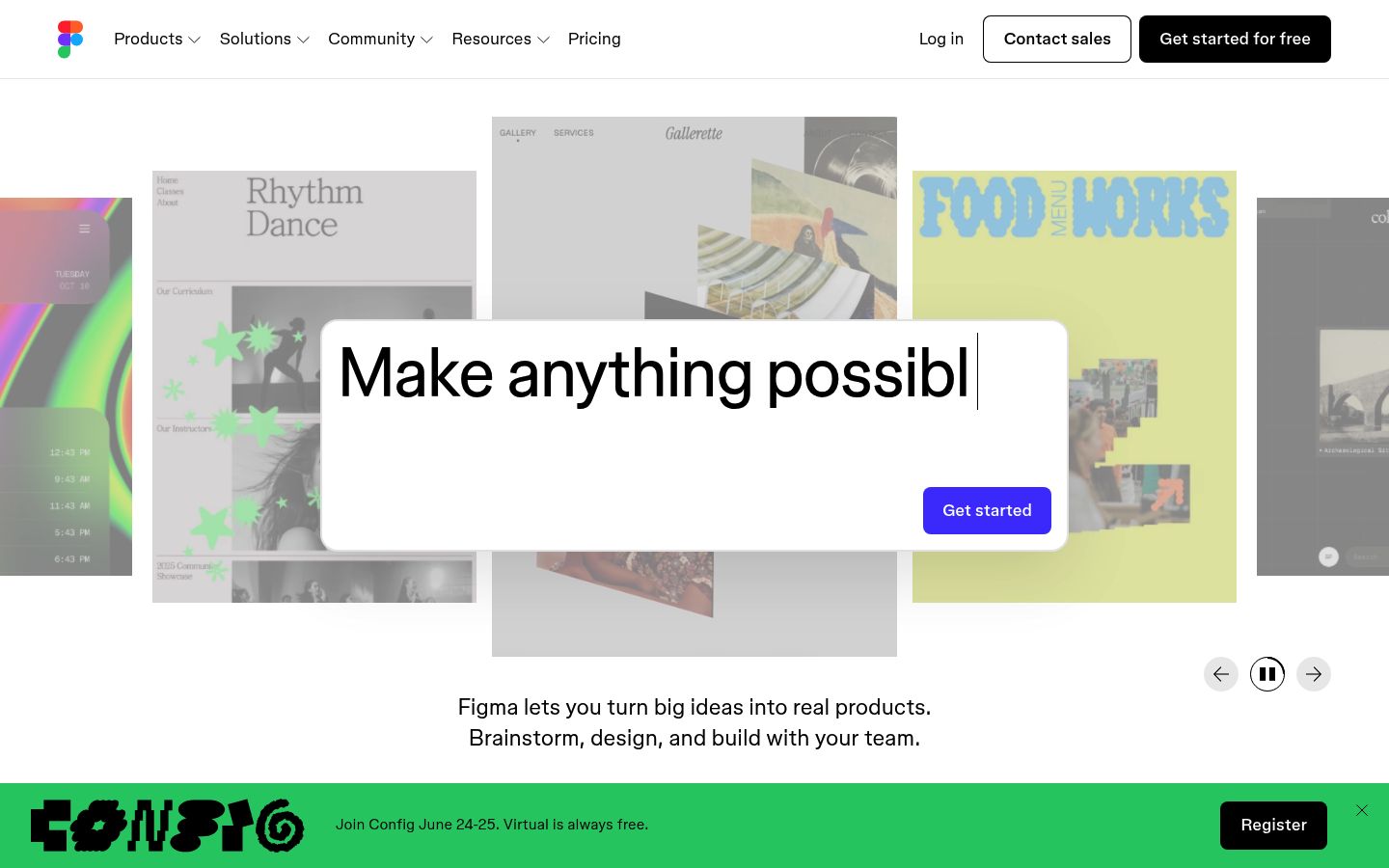
“Prompt to code anything you can imagine with AI. / Drop a design file into Figma Make and chat with AI to quickly create a live, functional app.”
The page leads with 'Prompt to code anything you can imagine with AI' and 'Drop a design file into Figma Make and chat with AI to quickly create a live, functional app,' presenting AI output as ready-to-ship. Buyer data shows 36% say AI output quality falls short of publish-ready and buyers explicitly want 'AI output quality examples or before/after samples,' which the page does not provide.
- 02The two testimonials are from unnamed companies.
“Both quotes are attributed only to job titles — 'Head of Design' — with no company name, no industry, no team size. A mid-market engineering leader or enterprise buyer has no anchor to decide whether the proof applies to them.”
The two testimonials are from unnamed companies. A visitor can't tell if Figma works for a company like theirs.
- 03The page never tells a visitor what to do after 'Get started for free.
“There is one CTA on the page: 'Get started for free.' No 'Talk to sales,' no 'Request a demo,' no enterprise contact path. The stated ICP is mid-market to enterprise teams — buyers who arrive with procurement questions, not signup intent.”
The page never tells a visitor what to do after 'Get started for free.' Enterprise teams don't start with a free account — they need a different door, and the page doesn't have one.
- 04The page introduces eight distinct product surfaces in the body but never tells the visitor which one to start with.
“Figma Make, Figma MCP, Figma Sites, Dev Mode, Figma Buzz, design systems, templates, and community showcases each get their own section with their own 'Explore' link. No section signals priority. A first-time enterprise evaluator leaves without a clear next step.”
The page introduces eight distinct product surfaces in the body but never tells the visitor which one to start with. The result is a menu, not a path.
- 05Your social proof undercuts the completeness claim in your headline.
“Nearly everything that designers and developers need is available in Figma.”
Your headline says 'Make anything possible, all in Figma.' Then the first named testimonial says 'nearly everything.' That single word 'nearly' opens a gap the page never closes — a reader scanning for reasons to pick Figma over an alternative just found one reason to keep looking.
Figma’s other surfaces.
- figma.comHomepage
- figma.com/pricingTracked
- figma.com/dev-modeTracked
About Figma’s Lytms scan.
What did Lytms score Figma's homepage?
What's Figma's strongest dimension?
What's the weakest dimension on Figma's page?
What's the biggest leak on Figma's homepage?
How does Figma compare to peers?
When was Figma's page last scanned?
One-click citation for press, blog, and academic use.
Lytms scans of public B2B SaaS landing pages are independent and free to cite. Pick a format below and we’ll copy it to your clipboard.
Lytms Research Team. (2026). Figma landing page review (Lytms score 5.4/10). Retrieved May 17, 2026 from https://lytms.ai/brand/figma
Score yours like Figma. See yours.
One URL. About 2 minutes.